

There are many factors involved in creating a website that really works; both for your customers and for your company.
Here at Venture Forge, we spend a lot of time getting to know you, your ideal clients and your company so that we can create the perfect ecommerce site to drive your business forward.
Let’s take a look at what makes a successful online store and why, as we run through our Top 20 Shopify stores for 2020.
1. Pop Chart Lab
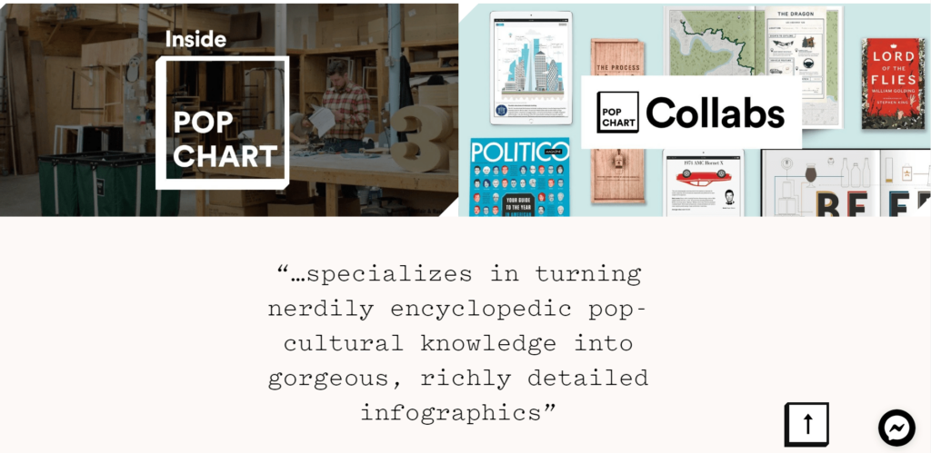
Pop Chart Lab’s colourful and funky products are showcased nicely against the simple background. The user experience is easy and enjoyable, with a large, easy-to-read font throughout and clear product categories that really make sense.
2. House of Holland
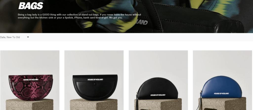
Clever use of copy and edgy photography mean that the overall tone of the Henry Holland website matches their product style perfectly. They keep the whole thing fun and informal while providing a simple and intuitive shopping platform that complements their brand image.
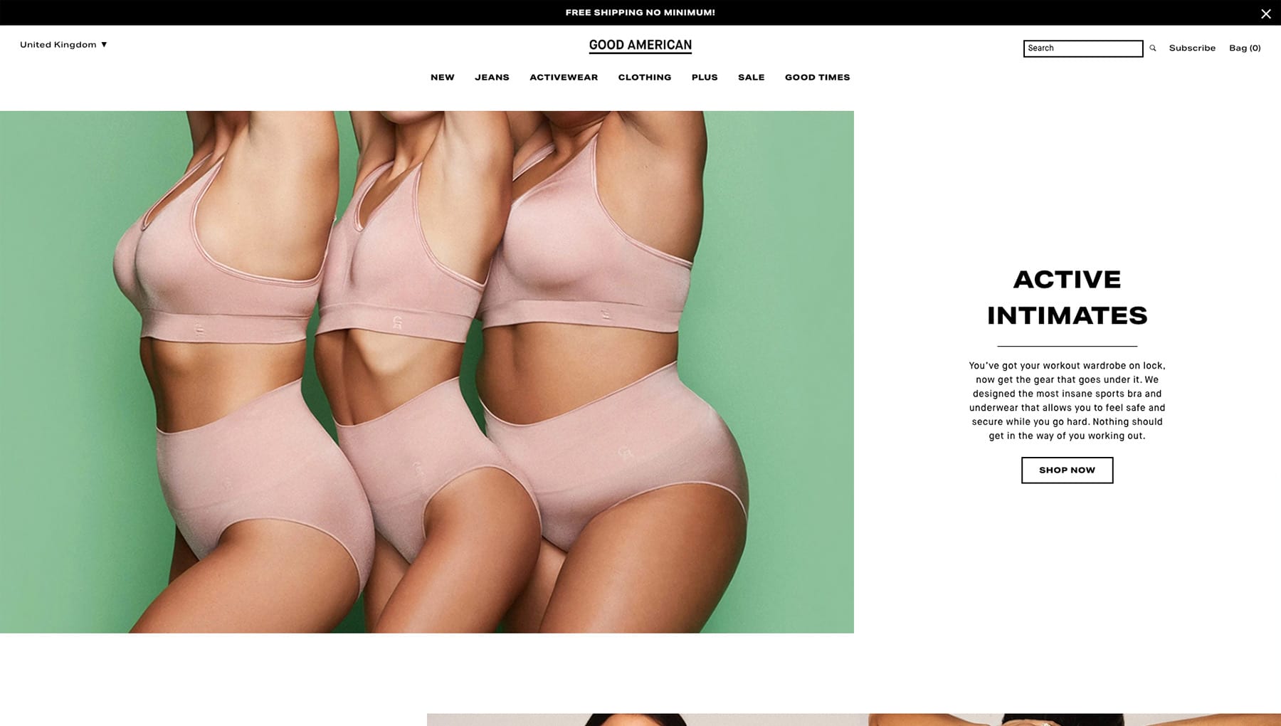
3. Good American
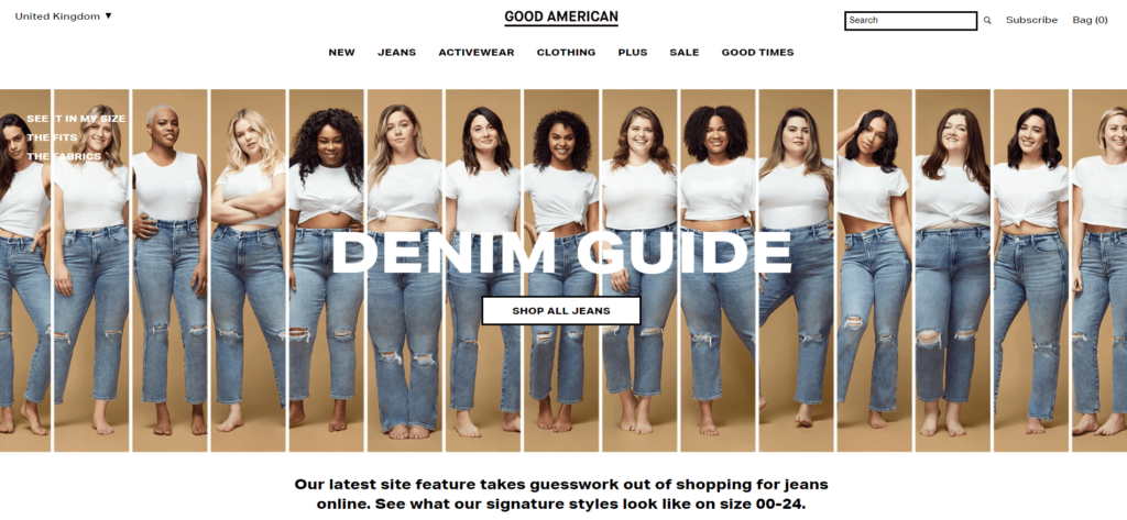
Good American’s unique approach to displaying their garments shows that they have really put the user at the heart of their website design. Each item of clothing is modelled by women of varying dress sizes so the shopper can visualise how the garment would look on their own body shape. Such a simple idea that really puts this brand ahead of the game.
4. VeloSkin
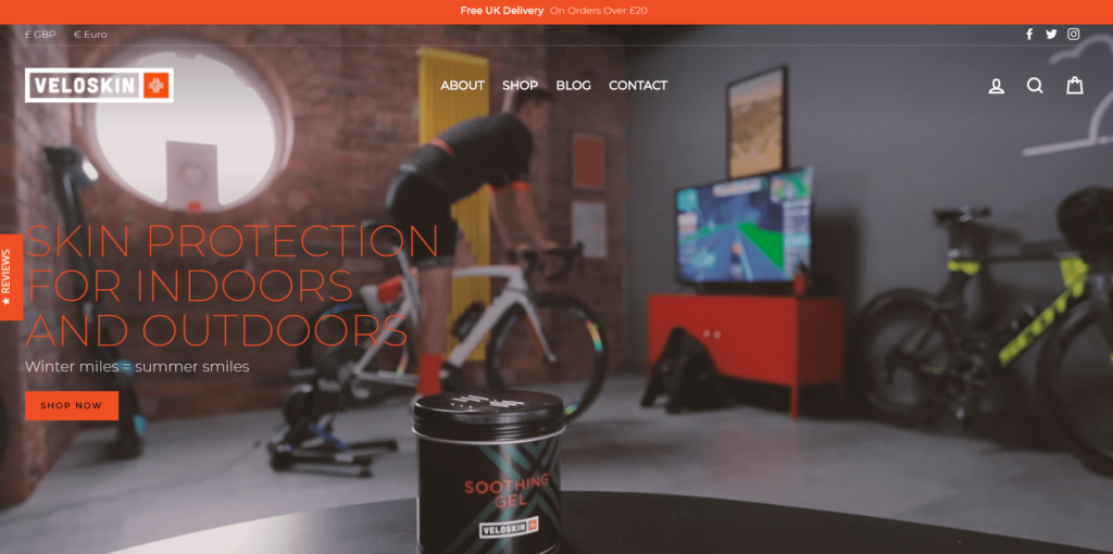
As one of our own brands, VeloSkin has a website designed specifically to appeal to the cycling enthusiast. We know that a homepage video featuring elite bicycles, specialist equipment and a cyclist using current training software quickly captures the attention of our target market. With careful product placement, tight copy and simple menu options, the result is a striking and on-brand website that performs well.
5. Beardbrand
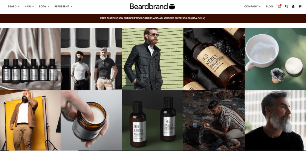
This cleverly designed website achieves so much on one page. Bold visuals (each one linking to the same image on their Instagram account to generate cross-channel traffic) and a clear brand message means that users can instantly get a feel for the brand and navigate easily to the product they want to find out more about. Note the clever use of the ‘message’ icon in the top right corner that links through to a newsletter sign-up pop-up.
6. Chalkd
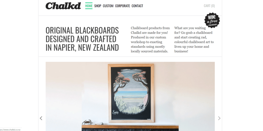
This clean and crisp website allows the product to take centre stage. The homepage copy manages to pack in a lot of vital information concisely and the scrolling images of the Chalkd range of blackboards instantly catches the eye. A good example of letting a great product speak for itself.
7. Death Wish Coffee
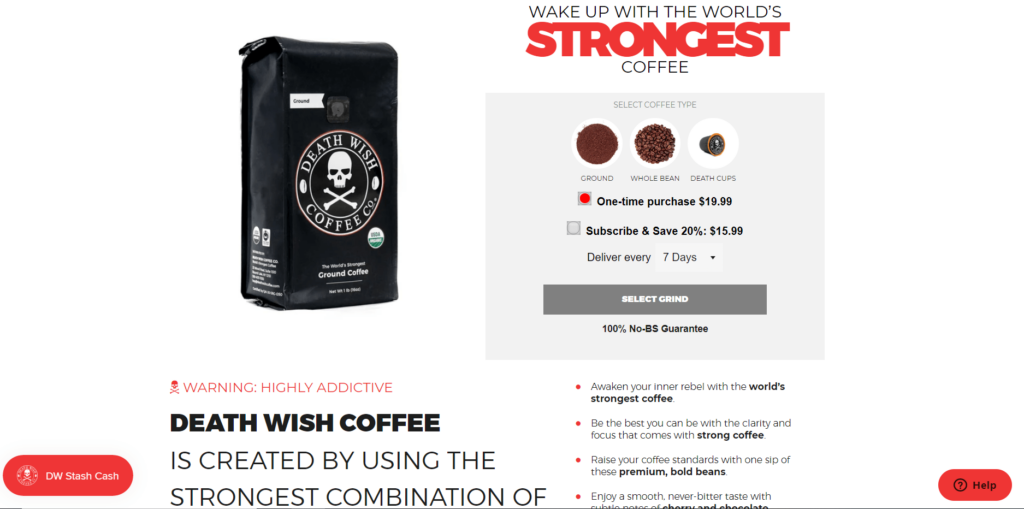
With a name like Death Wish, this coffee company needed a strong online presence to match, and this clean and bold website certainly delivers. Punchy copy such as ‘WARNING: HIGHLY ADDICTIVE’ along with the brand logo entice the user to want to see if this coffee really does pack a punch.
8. Tanner Goods
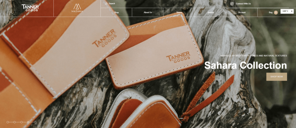
Tanner Goods sell handcrafted, durable products that are made to last and they use outdoor backdrops to reinforce that concept. Muted colours and a down-to-earth feel make this website an authentic reflection of their brand.
9. WaterAid
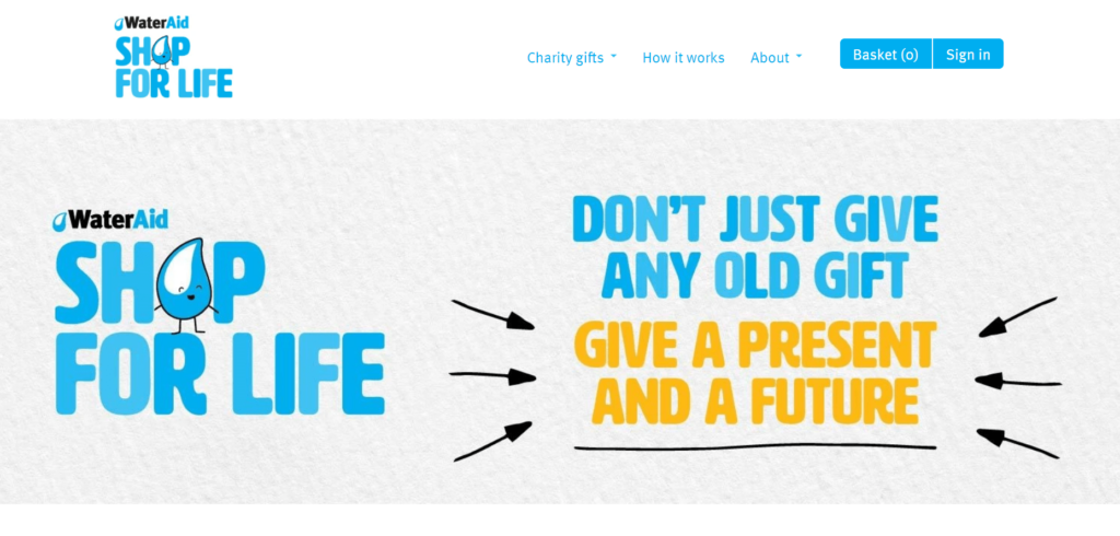
WaterAid is a charity that allows conscientious consumers to buy gifts that help to provide clean water to developing countries. Their website uses little to no imagery but instead focuses on instantly communicating the brand message clearly with a simple design that suits the company’s no-frills approach.
10. The Economist
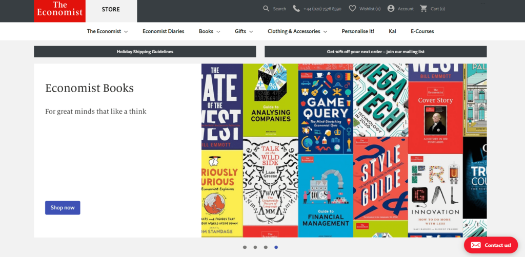
The Economist’s website manages to be both simple and eye-catching at the same time. It has a classic feel that is on-brand but uses clever wordplay and colourful product imagery to add interest.
11. Unconditional
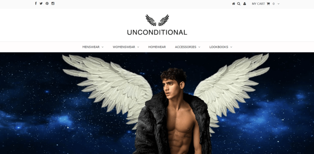
Keeping things simple with a plain white background and a series of scrolling images, Unconditional has an attractive looking website that is easy to navigate. The company founder describes the aesthetic as “a winning combination of the laid back and the edgy” and this website fits in well with that description.
12. Millk
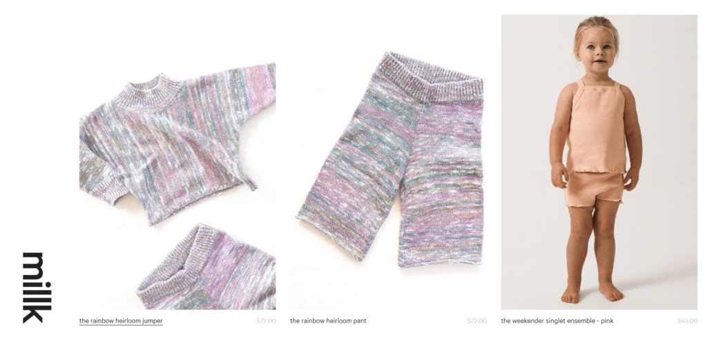
Australian company, Millk, was founded by two women who couldn’t find natural fibre, easy to wear clothes that they wanted to dress their children in. The solution? They set up their own company that makes beautiful yet practical children’s clothing, durable enough to be handed down when grown out of. Their simple, no-fuss website ties in with their organic start and provides an efficient shopping experience for busy parents.
13. Gymshark
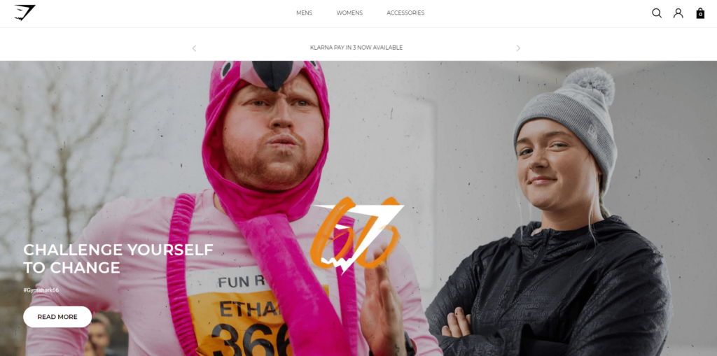
With an intriguing homepage image featuring ‘real’ people, the Gymshark brand lets you know straight away that it offers something a little different to other sporting apparel designers. The website has a plain white background, with all product photographs set against a neutral backdrop making browsing an easy and enjoyable experience.
14. Myakka
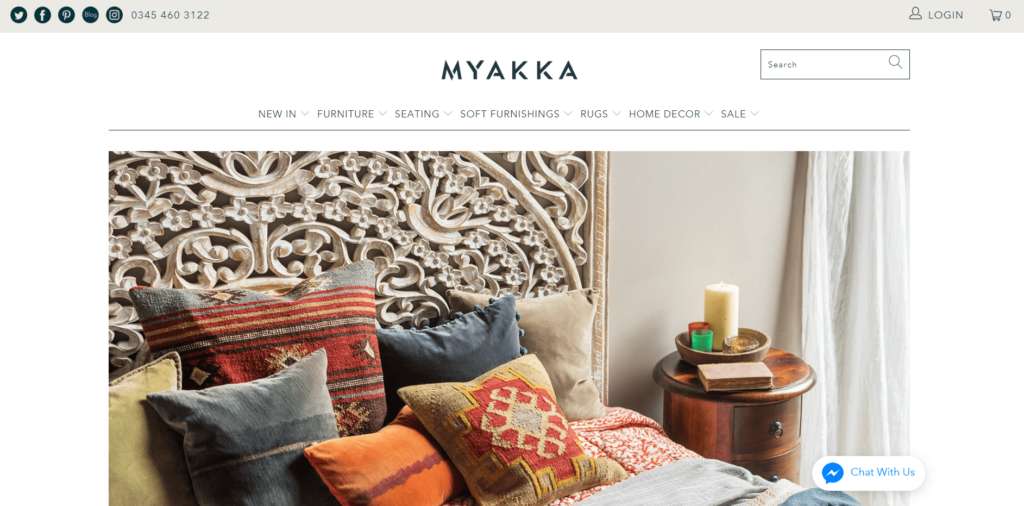
Creating an immediate impact, the homepage image on Myakka’s website instantly shows the detail and craftsmanship that goes into these ethically sourced, beautiful Indian products. The simplicity of the white background lets the image stand out and the rest of this website follows suit, with striking product photography and neat typography throughout.
15. Bremont
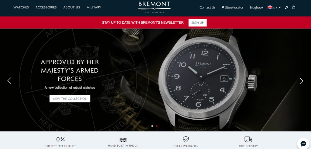
High-end British watchmaker Bremont uses impactful wording and close-up product photography to make an impact. The dark background adds to the luxury feel of this website and creates an air of exclusivity and aspiration that ties in with the brand image perfectly.
16. Factory 43
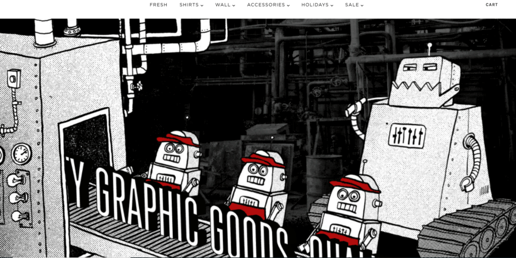
For a company that sells ‘Quality Graphic Goods’, what better way to showcase this than through the graphics on your website? This company manages to get across its quirky nature while providing a simple and enjoyable shopping experience for its customers.
17. Yoga Rebel
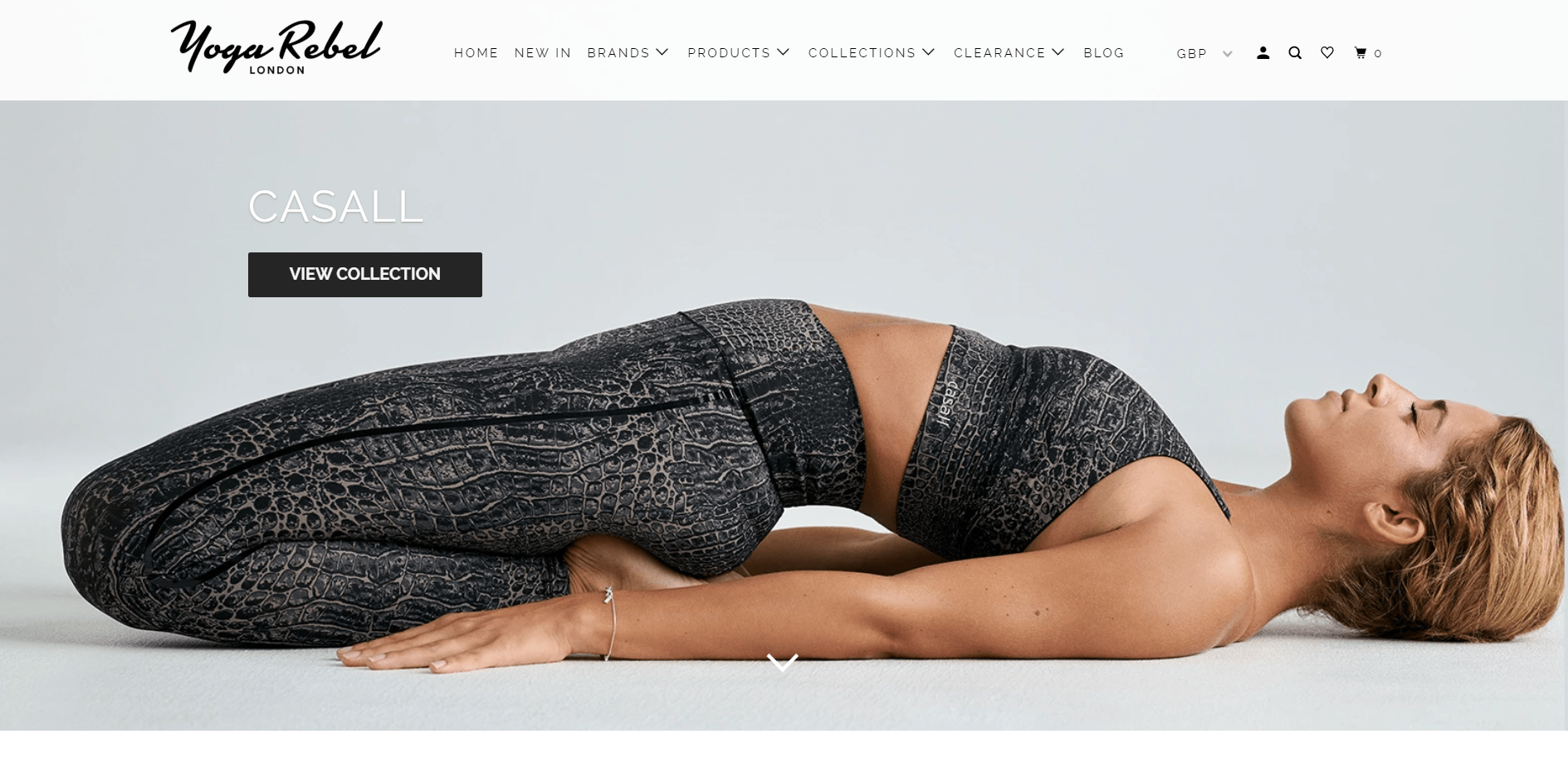
Featuring stunning lifestyle photography (check out their Instagram feed too), this beautiful website provides a dose of aspiration and inspiration to its customers. With an active blog, clear product categories and a simple layout, it’s no wonder that Shopify named this as one of their favourite Shopify stores.
18. Muse
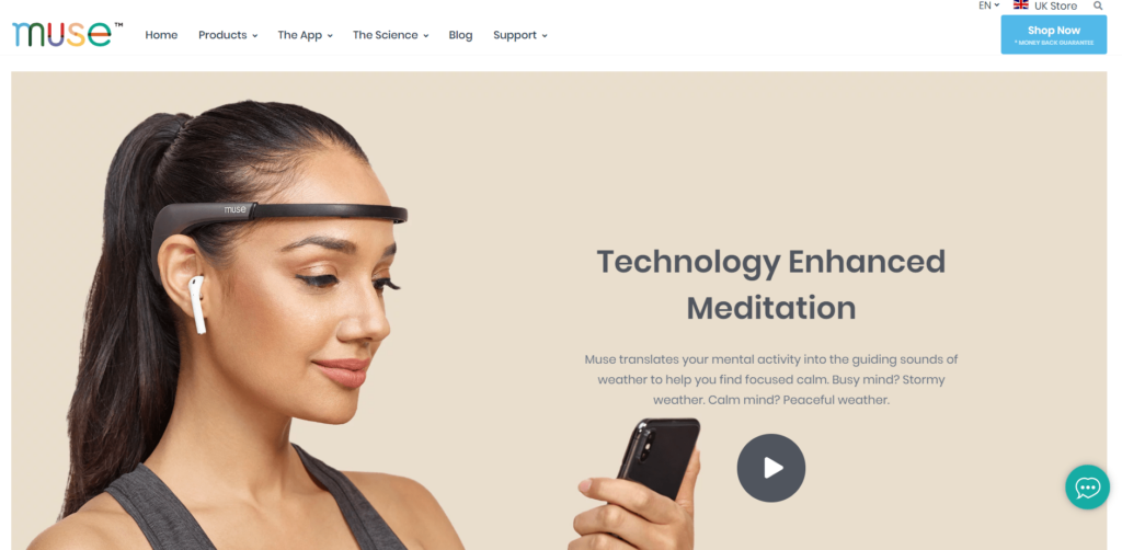
The clean lines and muted colours of the Muse website create a calmness that fits with the meditation tools that this company offers. The website does a great job in educating the customer about how this fascinating piece of software works and bridges the gap between a highly technical process and the end-user.
19. Victoria Beckham
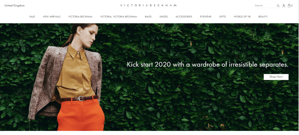
The Victoria Beckham website offers strong product images against a white background. Minimal copy and a clear and comprehensive menu make this store easy to navigate and the ability to hover over items to reveal the product description, cost and even sizes in stock is a great feature.
20. Haus
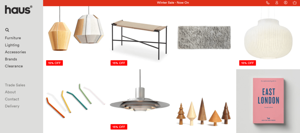
Using a stark white background and great product photography, Haus has created a striking website that makes browsing and shopping a truly enjoyable experience. The no-nonsense style and clean lines of this Shopify store complement the brand perfectly.
If you’d like to know more about creating the perfect ecommerce site, get in touch.
